 |
This is my very first CASEstudy challenge- love the phenomenal contributors and amazing creative inspiration!
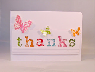
I used lots of A Muse Studio shimmering damask card stock (just lovely!) and a few more letters from my PTI Block Alphabet die set with this white on white design (one plain, one glittered). There's a bit of dimension in this card which is a little difficult to appreciate.


14 comments:
Michelle,
This is so pretty. If I received this, I'd be so impressed with the bright colors and glimmer that I'd feel I needed to send a thank you card back for the "work of art."
WOW! This is just STUNNING! all those colors are so cheerful...
What an AWESOME take on the CASE Study; I'm so very, very happy you played along with us! :)
Hugs!
Aimes
x
These are beautiful, Michelle! The colorful paper behind the cut out letters is so pretty, and I especially like the strips of glitter on the second version. Thanks for joining us this week at CASE Study!
I love this, its so bright and cheery love the colors and the butterflies!
Oh gosh, this is so cute! I love the different colors behind the letters!
Super cute take on the inspiration!
oh my, this is sooooo cute...luv it...hope you have a wonderful weekend!
enjoy *~*
Love the clean look. A very pretty card!
Wow, Michelle, this is so pretty! I can't wait to get my Block Alphabet dies and try this for myself. Gorgeous!
Wow, this is stunning!
I love your take on the challenge. I'm curious how did you keep all the letters so perfectly straight as you die cut them? Did you tape them to your card stock? Inquiring minds would love to know. This is a gorgeous card you deserve to win.
This is a beautiful card Michelle, in fact I just love all your cards! x
Gorgeous! I like your thinking to use the reverse cut-out of the letters. Very neat!
Post a Comment