Papertrey ink - Design team tips
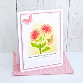
Happy Fri-yay!! I'm here to share my very first Design Team Tip with you for Papertrey Ink. And.... it's all about easy ink blending and how you can create not only the perfect edge (and the perfect spot for your sentiment!), but also a lovely background for your image! I am certainly no expert at this ink blending thing, but oh.... how I love the soft, subtle look and added bit of interest! Plus, I 'needed' to use those lovely new Picket Fence Studios blender brushes (and, yes, they might just be 'life changing'!). So, I am jumpin' in and trying my hand at ink blending - the CAS version!
I started with my supplies - lots of white card stock, a few shades of yellow, blue and green as my blending colors, a floral stamp set ( 'Flower Favorites'), 1" masking tape and those lovely brushes (thank you Buffalo Stamps!). Then I just began to play.... ink blending and stamping away!
I placed the 1" masking tape just above the stitched line on my white card front/panel and blended the color - trying Papertrey Ink's Harvest Gold and a few other Distress colors. I loved the subtlety of the Harvest Gold blending, as it allowed the pretty pinks/corals/reds to really stand out and created a subtle divide and perfect placement for the Weathervane inked sentiment (from the Happy Hearts stamp set).
These cards worked up so quickly that I had time to create a little card set and matching Bitty Big patterned envelopes. A simple layer of color behind each panel and a petite butterfly were the finishing touches!


Michelle!!!! I love, LOVE, L.O.V.E. these cards and the envelopes just push them over the top. THANK YOU for sharing this design tip. Perfect for my 'need for birthday cards' stamping goal this weekend.
ReplyDeleteWith the blending "stopped" like that at an invisible line, it creates a grounding space for the sentiment. very clever! I'll be trying that trick! Thank you!
ReplyDeleteI love this! It's a good reminder that sometimes the simple techniques are as beautiful as the more complex ones.
ReplyDeleteAwe, Michelle, these make my heart sing! I love the emphasis the ink blending gives to your design. Your envelopes are so fun in Bitty Bigs. Have been eyeballing those new brushes, and now I’m sure I “need” them. 😉
ReplyDeleteI love masking off a focal point area, but have never done quite this design--love it! I got my brushes from Amazon for $9 & they look exactly the same & I love them! No brushes have come out & they blend beautifully!
ReplyDeleteThese are just lovely Michelle, thanks for the dose of spring!
ReplyDeleteThese are SO beautiful! Thank you for the tips!
ReplyDelete